Studio Design Inspiration
As I'm gearing for the holiday closure and studio move, I'm collecting my inspiration for the studio design. As luck would have it, the Ikea 2010 Catalogue has hit the web - I sat there for about an hour flipping through the online catalogue. (You can view it online here) Although I'm not a fan of a larger percentage of it, just because of my style, a few items stood out for the new studio.
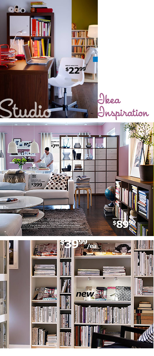
Here are my top three loves from the catalogue for the studio...
I love, love the top picture because it is exactly what I want the studio to be like, white walls, but punches of colour via books/art. The walnut Expedit shelf/desk combo is stunning, although I think the desk itself is MUCH too small for me. The new walnut colour in the Expedit line is fantastic...
The bottom picture is of a new item for the Billy Bookcase which is the tilted shelf for an awesome display of magazines. I drooled over this look! Maybe it can be encorporated into the design somehow.
I made a cup of coffee, and enjoyed about 1/2 an hour of flipping through their online catalogue. I printed off individual pages that caught my eye.

No comments:
Post a Comment
We'd love to hear what you have to say!! If you're asking a question we recommend e-mailing us at info@pennypeople.com vs. posting it here. But if you do post it here, just be sure to check back for a reply!
Note: Only a member of this blog may post a comment.